I want to preface this by saying that I am not a truncator (That’s not a word) and I will never be a truncator, but a lot of people are, and a lot of people do it very very badly.
Not only am I a blogger, but I’m also a blog-reader. I use Feedly, since Google Reader went all dodo bird on us.
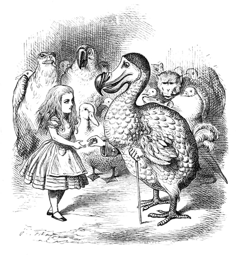
I really just wanted to use that image. Look at his creepy little hands. And Alice is just like “sure, I’ll take your creepy little man-bird hand.”
So, on mobile Feedly all of the feeds have the title of the post, a two line bit of the post, an image, and the name of the blog. Usually, it looks like this:
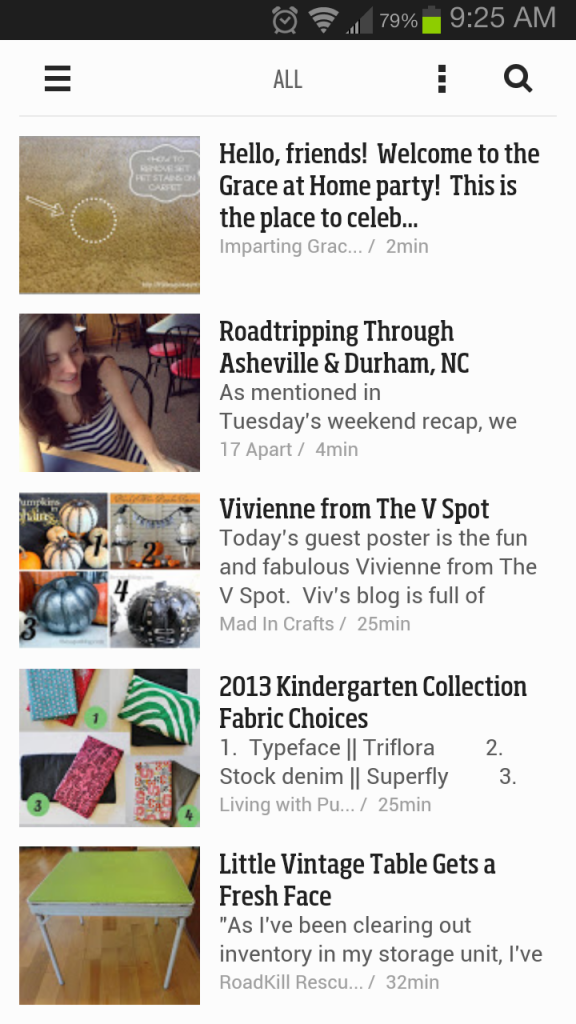
And everything is wonderful. There’s an interesting title, a relatively interesting image, and a good first few lines to make me want to click on things. If any of these blogs truncate (one of them does, and I’ll get to that soon) I’m more likely to click on their blog and actually want to read more, which makes me more likely to want to visit their blog and give them pageviews. Just like how interesting content makes me more likely to want to comment, which means more pageviews.
But sometimes, my feed looks like this:
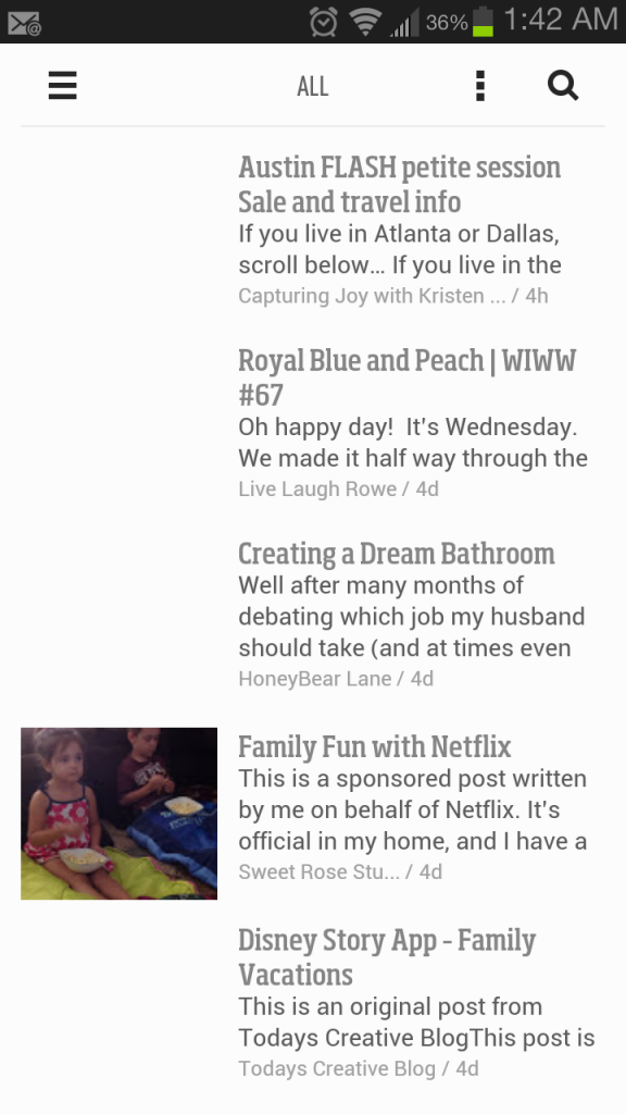
Every single one of these blogs truncates their feed, and every single one of them makes me sad because the way they truncate doesn’t make me want to visit their blog, and actually makes them LOSE the pageviews that they’re hoping to gain by truncating their blogs.
Don’t get me wrong, I’m sure avid fans of these blogs will visit and comment no matter what the feed looks like, and if you have an awesome title, like “Creating a Dream Bathroom“, you’re more likely to get those pageviews, but if you’re a small blog with no followers (you know, like me) truncating your blog in an uninteresting way is never going to get you where you want to go.
So what’s the best way to truncate your blog for the greatest amount of readership? Take queues from some blogs who do it really, really well. That blog that I mentioned above that truncates? That would be Roadkill Rescue, which is written by the same person who writes a number of other blogs, including Infarrantly Creative. She’s pretty much a genius truncator, and if you’re going to truncate your blog, you should model it after hers.
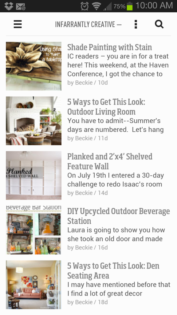
Interesting title? Check.
Interesting photo? Check. (Also great for Pinterest)
Interesting blurb? Check.
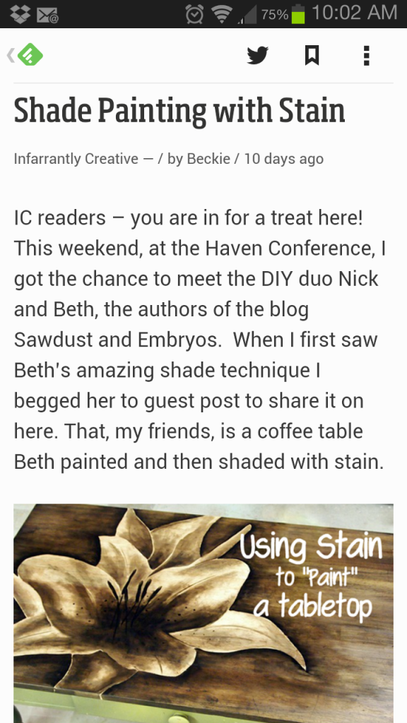
I almost always click on the “read more” link because the truncated part of the feed is so interesting.
The formula for a good truncated feed is pretty simple. Write a good title, write a good first paragraph, create a relevant image, link to your blog, and you’re good to go! But you have to do ALL of them. I’ve seen truncated posts that just say “visit this blog to read the rest!” and don’t link to the post or the blog and it’s like… that’s absolutely NOT going to happen.
I do have to add this. I am vehemently against truncating posts. I could write a whole post about it, but Kim Werker already did that over here, so you should go read that.


